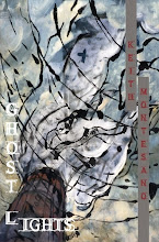
Just got my third set of Ghost Lights proof corrections sent off.
I'm starting to realize that I could see myself working, possibly somehow, in publishing in the future. Or I could see myself working for a press in some capacity at the very least. I'm really interested in everything that has to do with typesetting (as far as a computer program, not the old school way), font, look, size, etc.
Someone had a link on Facebook the other day to this interview with Jason Koo.
One of his poems is in the same issue of ACM I also have a poem in, and though I'd heard of him, I hadn't read any of his work until then. Now, after reading this interview, I'm even more interested in getting his book.
He also says one thing that I've never seen in an interview before, regarding the differences of labor and work, and it's something that I find extremely interesting, especially when it comes to the work he had to do on his book, the work that didn't involve taking seven years to get it accepted for publication:
Take my first book: it represents what I think of as my work, and each poem within it represents that work; but putting that book together was one mother of a labor-intensive process. The production of the book itself into a physical object was exasperating. C&R gave me total control over how the book turned out, which was great; but the downside was that I got almost no creative or editorial feedback. So I ended up having to make decisions about the width of the margins, the size and type of font for the poems, the poem titles, the page numbers, the first title page, the second title page, the epigraphs -- decisions I was not expecting to have to make. This might sound simple, but it’s not, especially if you’re not a professional designer; you don’t have a real idea of how things are going to look when they’re in book form. I had no idea that 12-pt Garamond -- which looks pretty small on an 8 ½ by 11-inch page -- looks huge on a 6 by 9-inch page. I wasn’t sure how to design my title pages, where to put the titles and name and how to big to make them. So there I was with a tape measure going through all my poetry books, comparing the designs and making these decisions on the fly. And when my manuscript went from Word to Adobe InDesign, all these little things got screwed up that normally get screwed up like the tabs for my indented lines that I’d spent hours setting when I prepared the manuscript for production (so they wouldn’t get screwed up). C&R’s designer was doing the best he could to make sure all the tabs were correct, but you can only stare at tabs for so long before you go crazy, and he only had weekends to work on the manuscript, so ultimately it was up to me to make sure everything came out right. Also, I didn’t have a proofreader; and honestly, could a proofreader even be expected to make sure all the tabs were correct for a poem like “2046 Love Songs of Wong Kar Wai”? That’s not in the proofreading manual. I went through so many rounds of corrections for the book before it was ready to be sent to the printer; and most of the time I wasn’t even looking at the words of the poems, I was checking tabs and margins with my tape measure. I think my girlfriend started to think she was dating a tailor. And my thought during all this time was: I’m not enjoying this. It wasn’t the work of poetry, even though I was preparing my first work of poetry. This was definitely labor, but clearly necessary labor if I wanted my book to look right.
It's pretty fascinating to me for a few reasons. Though Bear clearly knows what he's doing when it comes to making books (Dream Horse Press has not only been around for nearly ten years, but look at the future line-up, Ghost Lights excluded, and you'll see that it's a press that should be sticking around for a very long time to come...), I've gotten a lot of control with my choices thus far. I hope I haven't been too much of a pain in the ass also, with my questions and concerns and nitpicking, but I'm very particular when it comes to the look of a book, especially the font. Not only that, but a lot of my questions come from my lack of experience with this, in addition to my willingness to learn from someone who knows what they're doing.
Maybe one day I'll talk about some books that I don't think look overall too spectacular (though I probably won't, because it's not my place to go saying that about other presses, quite honestly), but I think it's important for people to realize that, if they can have a lot of control, they should spend time trying to make it a piece of art, in its entirety.
Sometimes, though, unfortunately, much of these wants are out of the poet's hands...
Granted, some folks get lucky and get with a press that not only lets them have a lot of control, but also has typesetters and copy editors and every other position you can think of, so they can concentrate on making sure their words are their words once they're officially on the page.
Even Jason's comment about Garamond in 12 point makes sense to me. My first proof was in a font that made me feel a little claustrophobic, so I wanted to see if Garamond was possible. Because some my lines are so long, we took the font down to 11, and right now it looks great. But in the back of my mind, I kept saying, "Is this too small?" I tried to imagine how it would look on the page, but it's tough when you only have a .pdf in front of you on the computer screen. From Jason's words, though, it looks like 11 should be just about right.
Jason also seems to do a lot of indenting with his poems, and many of the poems in Ghost Lights aren't left justified... I know this has been a pain to deal with also, because some of these programs don't seem to be as conducive to these types of corrections, but it's these things that you have to have, if the space on the page permits, exactly right.
I'm not really sure exactly what I'm trying to say here, but I think it comes down to being really interested in all the specific typesetting and book-making processes.
Now I'm noticing more things in books that I never noticed before.
Are the titles capitalized and not bold?
Are the titles italicized and not capitalized?
Are the titles bold and not capitalized?
How close together are the letters? Is the font boring?
Is the font claustrophobic?
And on and on and on...
Maybe some would call all of this labor, to a certain degree, but I really like this aspect of making sure everything is (at least closest to) exactly how I want it. And time is really not a factor when it comes to getting to these final stages, because though I ultimately want people to like the book for the poems inside it, it would also be great if they agreed with my choices that don't have to do with the words used.
*
I can't stop listening to the new Eluvium record, Similes. Talk Amongst the Trees is one of my favorite records of all time, and I was a bit disappointed, as much as it pains me to say it, with Copia.
But Similes is beautiful, sad, and pretty wonderful overall. There are vocals this time around, and some soft percussion in places. But many of the tracks also feel like "songs," which is new territory he's exploring.
Do yourself this small favor when time allows and pick it up.
*
Recently, we finally got a Blu-Ray player, one that plays multi-region and PAL discs, so we don't have to screw around with locked discs.
I keep saying to myself, "Where the hell have I been?" As far as technology goes, I don't understand how they do it, and I don't understand how we waited this long to witness it.
I'm a huge fan of Magnolia, for example, which is an amazing film too many people love to hate. I even skipped school in 10th or 11th grade to go see it. I've seen it at least twenty times by now, and in the first five minutes of the recently released Blu-Ray discs, I kept noticing things I had never seen (the sweep of the camera through Linda's closet, for example, showing the size of it, the detail of it, right before she exits to get in the car). So when you think about the entire three hours, it was really like seeing a different film.
When I got my IMac I was pretty impressed with all that it could do, and I still love it, but I feel like Blu-Ray is something pretty monumental in the grand scheme of technological advances of the last twenty years, at least.
Granted, I probably spend more time watching movies than I do writing poetry, so I can see how the average viewer with a 1080p TV says, "Yeah, it looks better," etc. But wow. I feel like a little kid again, and I haven't been this impressed with technology in a long time, if ever.
Take, for example, the long dolly shot in Children of Men, the one where blood gets spattered on the lens and the shot keeps going, when Theo has Kee and the baby and he's trying to get them to safety. Everything is literally heart-stopping, both visually and aurally.
The end of Full Metal Jacket: when Eightball's getting shot in slow-motion as the sniper draws the rest of the men in, and the backgrounds of smoke are curling, and fires flicker in crumbling windows and empty doorways. Then they wakj away in darkness as all the buildings are on fire around them.
And all the bright shots of Las Vegas in Casino? Completely insane.
Days of Heaven comes out in March. And tell me The Thin Red Line's not going to look immaculate, when it gets released of course.
And that's the other point: you can take a movie from the 60s or 70s and make it look and sound as amazing as it possibly can.
I'm sold. I'm beyond giddy and happy and excited. I'll be buying and renting many more Blu-Rays in the future, especially since they're, somehow, even cheaper now than regular DVDs.
Showing posts with label eluvium. Show all posts
Showing posts with label eluvium. Show all posts
Thursday, February 4, 2010
Thursday, June 4, 2009
Must Read After My Death
I need to write about how amazing Must Read After My Death is.
More and more when I see movies I feel like I have to eventually integrate film into my classes when I'm actually a true professor teaching somewhere, probably way down the road.
The film is a pastiche of old Super 8 movies and Dictaphone recordings from a family of six in Connecticut in the 1960s. Morgan Dews apparently somehow found his grandmother's package of all of this (you'll see all of it at the beginning of the film) marked "Must Read After My Death."
It's one of the most sad and beautiful films I've ever seen. Reminiscent, technique-wise, of 51 Birch Street, Tarnation, Capturing the Friedmans, About a Son, and probably some others, the point here isn't originality.
But what makes the film powerful is what's culled together to make it. The images don't necessarily speak for the narrative shred we're listening to, but there are some that won't leave your mind, some that keep playing over different parts of different voices. You can tell this was a labor of love for Morgan Dews, and until close to the end you wonder how he's related to the family at all (you'll see what I mean as you're watching).
And with fifty hours of recordings, winnowing that down to a little over an hour would not be the easiest task. Then we're left to wonder what was left out, and what dictated the choices Dews made in compiling every recording and image.
Another thing is the score, which wouldn't have even needed to be a part of it to make it so powerful. But the score of Paul Damian Hogan the Third somehow combines the guitar washes of Eluvium, the key and tonal glitch of Fennesz, and the warped, warm repetitions of William Basinski. I wouldn't be surprised if someone wanted to put this out as a 70-minute album, with just the voices and the soundtrack. It could easily work that way too.
See it. See it. See it.
More and more when I see movies I feel like I have to eventually integrate film into my classes when I'm actually a true professor teaching somewhere, probably way down the road.
The film is a pastiche of old Super 8 movies and Dictaphone recordings from a family of six in Connecticut in the 1960s. Morgan Dews apparently somehow found his grandmother's package of all of this (you'll see all of it at the beginning of the film) marked "Must Read After My Death."
It's one of the most sad and beautiful films I've ever seen. Reminiscent, technique-wise, of 51 Birch Street, Tarnation, Capturing the Friedmans, About a Son, and probably some others, the point here isn't originality.
But what makes the film powerful is what's culled together to make it. The images don't necessarily speak for the narrative shred we're listening to, but there are some that won't leave your mind, some that keep playing over different parts of different voices. You can tell this was a labor of love for Morgan Dews, and until close to the end you wonder how he's related to the family at all (you'll see what I mean as you're watching).
And with fifty hours of recordings, winnowing that down to a little over an hour would not be the easiest task. Then we're left to wonder what was left out, and what dictated the choices Dews made in compiling every recording and image.
Another thing is the score, which wouldn't have even needed to be a part of it to make it so powerful. But the score of Paul Damian Hogan the Third somehow combines the guitar washes of Eluvium, the key and tonal glitch of Fennesz, and the warped, warm repetitions of William Basinski. I wouldn't be surprised if someone wanted to put this out as a 70-minute album, with just the voices and the soundtrack. It could easily work that way too.
See it. See it. See it.

Friday, October 3, 2008
Life Through Bombardment
Music is something I cannot live without. I honestly think I could do without poetry if I absolutely had to, but I'm not sure about music. Is that a bad thing to say? Or an odd thing to say? That said, I can't create music. I can create poetry. And though I can still get on a drum kit and play whatever within reason, I can never do what Steve Reich has done with minimalist percussion, or any of the other greats, whether you're talking about marimbas, piano, staccato voice, anything.
When I saw this on the Temporary Residence site I nearly shouted out loud. Eluvium is one of my favorite bands, projects, musicians -- however you'd like to categorize such a definition -- of all time. I saw him (Matthew Robert Cooper) open a few years ago for Mono at the now no longer Nanci Raygun in Richmond, and the show was inspiring to say the least.
Eluvium had a keyboard and a guitar: that was it. Lots of huge guitar washes and drones by the end after slow-building crescendoes abound, and a lot of the more subtle piano pieces he did on "An Accidental Memory in the Case of Death." And Mono was just insane. I think they did the beginning of "A Thousand Paper Cranes" too, which will now always make me think of Michael Angarano's speech near the end of Snow Angels. Unfortunately, Yahoo had my pictures. They didn't transfer over. So they're now lost. But at least I was there I suppose.
Here's the specs for "Life Through Bombardment," which I preordered as my only Christmas present for myself as soon as it went up two days ago:
Highly anticipated and long-overdue, "Life Through Bombardment" collects virtually every Eluvium song ever released (plus a bunch of rare and unreleased non-album tracks) into one stunning 7xLP set, all on vinyl for the first and only time. Each record is packaged in its own full-color jacket, f eaturing exquisite new artwork from Jeannie Lynn Paske, drawn exclusively for this set. The seven jackets are then bound into a beautiful dark green hardbound, linen-cover book, with metallic gold foil stamping and embossed text on the spine, and a beautiful full-color print embossed into the front cover. The inside front cover includes a removable old-fashioned library card, complete with personalized signatures from the artists and designers involved in the creation of this package. The final name on the library card will belong to the purchaser, hand-written and dated when purchased. The inside back cover includes a mind-blowing 12x36" foldout double-sided full-color poster insert, featuring more artwork from Ms. Paske. In addition, each copy of this set will include a unique digital code to download high-quality mp3s of the entire box set collection. This is limited to a one-time pressing of 1,000 copies, pressed onto 100% virgin black vinyl.
When I saw this on the Temporary Residence site I nearly shouted out loud. Eluvium is one of my favorite bands, projects, musicians -- however you'd like to categorize such a definition -- of all time. I saw him (Matthew Robert Cooper) open a few years ago for Mono at the now no longer Nanci Raygun in Richmond, and the show was inspiring to say the least.
Eluvium had a keyboard and a guitar: that was it. Lots of huge guitar washes and drones by the end after slow-building crescendoes abound, and a lot of the more subtle piano pieces he did on "An Accidental Memory in the Case of Death." And Mono was just insane. I think they did the beginning of "A Thousand Paper Cranes" too, which will now always make me think of Michael Angarano's speech near the end of Snow Angels. Unfortunately, Yahoo had my pictures. They didn't transfer over. So they're now lost. But at least I was there I suppose.
Here's the specs for "Life Through Bombardment," which I preordered as my only Christmas present for myself as soon as it went up two days ago:
Highly anticipated and long-overdue, "Life Through Bombardment" collects virtually every Eluvium song ever released (plus a bunch of rare and unreleased non-album tracks) into one stunning 7xLP set, all on vinyl for the first and only time. Each record is packaged in its own full-color jacket, f
 eaturing exquisite new artwork from Jeannie Lynn Paske, drawn exclusively for this set. The seven jackets are then bound into a beautiful dark green hardbound, linen-cover book, with metallic gold foil stamping and embossed text on the spine, and a beautiful full-color print embossed into the front cover. The inside front cover includes a removable old-fashioned library card, complete with personalized signatures from the artists and designers involved in the creation of this package. The final name on the library card will belong to the purchaser, hand-written and dated when purchased. The inside back cover includes a mind-blowing 12x36" foldout double-sided full-color poster insert, featuring more artwork from Ms. Paske. In addition, each copy of this set will include a unique digital code to download high-quality mp3s of the entire box set collection. This is limited to a one-time pressing of 1,000 copies, pressed onto 100% virgin black vinyl.
 TRACK LISTING
SIDE A:
1. The Unfinished
2. Under The Water It Glowed
3. There Wasn't Anything
SIDE B:
1. Zerthis Was A Shivering Human Image
2. I Am So Much More Me That You Are Perfectly You
SIDE C:
1. An Accidental Memory
2. Genius And The Thieves
3. Perfect Neglect In A Field Of Statues
4. Nepenthe
SIDE D:
1. In A Sense
2. The Well-Meaning Professor
3. An Accidental Memory In The Case Of Death
SIDE E:
1. New Animals From The Air
2. Show Us Our Homes
3. Area 41
SIDE F:
1. Everything To Come
2. Calm Of The Cast-Light Cloud
SIDE G:
1. Taken
2. We Say Goodbye To Ourselves
SIDE H:
1. One
2. Swallows In The Bath
SIDE I:
1. I Will Not Forget That I Have Forgotten
2. As I Drift Off
3. All The Sails
4. When I Live By The Garden And The Sea
SIDE J:
1. Untitled (For Piano)
2. Untitled (For Orchestra)
3. Untitled (For Rhodes And Tape)
4. Carousel
SIDE K:
1. Amreik
2. Indoor Swimming At The Space Station
3. Seeing You Off The Edges
SIDE L:
1. Prelude For Time Feelers
2. Requiem On Frankfort Ave.
3. Radio Ballet
4. (Intermission)
SIDE M:
1. After Nature
2. Reciting The Airships
3. Ostinato
SIDE N:
1. Hymn #1
2. Repose In Blue
Tuesday, August 19, 2008
Eli Manning is God
Thanks to everyone for the comments and emails about the engagement. It'll be in Pittsburgh, if I didn't say that already, so the long distance factor will prove I'm sure to be a bit of a pain. But we'll deal with it. I'm lucky she even said yes I suppose.
*
The new Mat thew Robert Cooper record has leaked, and thanks to Casey letting me know, I finally snagged it, and it's not surprisingly a very beautiful record. MRC usually puts out records under Eluvium, whose "Talk Amongst the Trees" is one of my favorite records ever. There's some Eluvium type guitar washes on this, but also more "Accidental Memory..." piano pieces. I wasn't a huge fan of "Copia," as a lot of the songs just didn't gel for me. Maybe it was the hugeness of the aimed production. I'm not sure. But this one seems to be on the money. Hopefully I'll get inspired to write to it. I've written most of my poems to atmospheric music. It's cliched as hell to say that now, since so many people run with that, but it's true for me and has been for as long as I can remember.
*
Craig Beaven sent me his 100 Favorite Movies list, as he and some friends have sent them to each other, so of course I decided I'll be making one too. I feel like mine's going to be a bit weird, as I won't have nearly as many "classics" on there as others may. "American Movie," for example, will easily be in my top 10, while "Little Monsters" will probably make the top 100. And there are a slew of directors like David Gordon Green, Paul Thomas Anderson, Alexander Payne, Harmony Korine, whose comprehensive films thus far may be spread out over the list, while leaving out a few I imagine.
And this is "Favorite" movies, which to me are the ones I can put on in any mood I'm in and watch, regardless of length, style, or anything else. 100 Desert Island Movies, then? The same type of thing? I'm not sure. But for me no Hitchcock will be on the list, and "Citizen Kane" doesn't make my Favorite list for sure.
I challenge anyone who's reading this to do the same. I'd love to see some of these lists. It would be good for me to see how many amazing movies I need to see that I haven't thus far for whatever reason.
*
To me, this whole argument is hilarious and uncalled for. I have to admit, however, that I was indeed entertained by it. I really don't know why Eduardo, who I don't even know, have never met, and whose work I've never seen, talks so much shit on people. It may all be seemingly innocent, but I can see why Collin and Steve got so pissed off. Then again, maybe that's why he does it, to get a rise out of whoever he can. If we write and send out we're involved in Po-Biz. Get used to it or become a dentist. But just like Foetry, if all of us spent less time bitching, we'd probably be producing more quality work, or at least work we're proud of, myself included.
*
The new issue of Diode is up, and in just a year Patty and Jeff have really done a hell of a job. The design's slick, simple without looking too basic or hurting the eyes, and they've had a number of great poets involved. Not only that, but they want moving work and have no defined aesthetic, which are the journals I tend to gravitate toward. Narrative poems by language poems by prose poems by completely experimental and uncategorized pieces. It's all there.
Recently, Nick Courtright had an interesting blog post (which I stole from Eduardo, who actually has a lot of good links when he's not starting blog brawls), and I think Diode is a journal that subscribes to this. I've never had a problem with reading just one poem by someone, and often I've bought books on the strength of one poem that blew me away. I've emailed poets and fiction writers to tell them how much I liked their single piece. But Diode tries to have a sampling, and that's great. And they're someone who may need to be mentioned on the post.
If you haven't sent work yet, you should. Greater things will be happening with the journal, and they're getting quality stuff by a ton of great up and comers in addition to the "established" folks, whatever that means. Now I'm starting to sound like a journal.
*
The new Mat
 thew Robert Cooper record has leaked, and thanks to Casey letting me know, I finally snagged it, and it's not surprisingly a very beautiful record. MRC usually puts out records under Eluvium, whose "Talk Amongst the Trees" is one of my favorite records ever. There's some Eluvium type guitar washes on this, but also more "Accidental Memory..." piano pieces. I wasn't a huge fan of "Copia," as a lot of the songs just didn't gel for me. Maybe it was the hugeness of the aimed production. I'm not sure. But this one seems to be on the money. Hopefully I'll get inspired to write to it. I've written most of my poems to atmospheric music. It's cliched as hell to say that now, since so many people run with that, but it's true for me and has been for as long as I can remember.
*
Craig Beaven sent me his 100 Favorite Movies list, as he and some friends have sent them to each other, so of course I decided I'll be making one too. I feel like mine's going to be a bit weird, as I won't have nearly as many "classics" on there as others may. "American Movie," for example, will easily be in my top 10, while "Little Monsters" will probably make the top 100. And there are a slew of directors like David Gordon Green, Paul Thomas Anderson, Alexander Payne, Harmony Korine, whose comprehensive films thus far may be spread out over the list, while leaving out a few I imagine.
And this is "Favorite" movies, which to me are the ones I can put on in any mood I'm in and watch, regardless of length, style, or anything else. 100 Desert Island Movies, then? The same type of thing? I'm not sure. But for me no Hitchcock will be on the list, and "Citizen Kane" doesn't make my Favorite list for sure.
I challenge anyone who's reading this to do the same. I'd love to see some of these lists. It would be good for me to see how many amazing movies I need to see that I haven't thus far for whatever reason.
*
To me, this whole argument is hilarious and uncalled for. I have to admit, however, that I was indeed entertained by it. I really don't know why Eduardo, who I don't even know, have never met, and whose work I've never seen, talks so much shit on people. It may all be seemingly innocent, but I can see why Collin and Steve got so pissed off. Then again, maybe that's why he does it, to get a rise out of whoever he can. If we write and send out we're involved in Po-Biz. Get used to it or become a dentist. But just like Foetry, if all of us spent less time bitching, we'd probably be producing more quality work, or at least work we're proud of, myself included.
*
The new issue of Diode is up, and in just a year Patty and Jeff have really done a hell of a job. The design's slick, simple without looking too basic or hurting the eyes, and they've had a number of great poets involved. Not only that, but they want moving work and have no defined aesthetic, which are the journals I tend to gravitate toward. Narrative poems by language poems by prose poems by completely experimental and uncategorized pieces. It's all there.
Recently, Nick Courtright had an interesting blog post (which I stole from Eduardo, who actually has a lot of good links when he's not starting blog brawls), and I think Diode is a journal that subscribes to this. I've never had a problem with reading just one poem by someone, and often I've bought books on the strength of one poem that blew me away. I've emailed poets and fiction writers to tell them how much I liked their single piece. But Diode tries to have a sampling, and that's great. And they're someone who may need to be mentioned on the post.
If you haven't sent work yet, you should. Greater things will be happening with the journal, and they're getting quality stuff by a ton of great up and comers in addition to the "established" folks, whatever that means. Now I'm starting to sound like a journal.
Subscribe to:
Posts (Atom)