Just watched Afterschool. After seeing The Last 15, I was expecting a lot from it. Though it didn't deliver as much as I'd hoped, I enjoyed it. Antonio Campos has balls, he's young, and he's doing his best to tackle important issues artfully and, dare I say, a bit recklessly, which I love.
You can say that for a lot of directors, I'm sure, but keep your eye on this guy.
*
Also saw Chungking Express (finally for the first time). Now I know why people have been talking about it for all these years. A beautiful, original, and thought-provoking film that I'll be seeing again in the future for sure.
*
Got my contributor copies of Phoebe yesterday in the mail. Looks great. A wild mix of styles too. Thanks again to Moriah and the rest of the editors. They did a nice job.
And there's a bonus poster in the inside pages of another piece of art from the artist who did the cover. I've never seen that before, and I love it. Maybe this will be a new bonus for contributors and subscribers if journals have enough money to do it. It's a great idea.
*
The plane ticket has been purchased for my week in Savannah with my brother and sister-in-law.
I love Savannah and wish we were closer to it.
They're most likely moving back somewhere north in the summer, so this may be my last time to go.
Needless to say, I'm excited.
Wednesday, February 24, 2010
Thursday, February 18, 2010
Gave
I finally sent out a new batch of poems yesterday to a bunch of journals.
I haven't done that in a long time. It felt good. Even if nothing pans out.
Somehow I still feel good about getting rejections, which forces me to write new stuff that the journals who rejected the poems may actually like next time around.
*
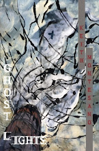
The fourth proof of Ghost Lights found its way to me a few days ago. It's really starting to make me smile now. It looks great, and it's getting to those final stages. Clean text, a good design, a good font.
We're trying to figure out cover art and color schemes for the cover and back cover soon. I have a few paintings I'm looking at. The one I wanted we couldn't get. So it's more looking.
I have a handful of blurbs now too, with, I think, one more to go.
Things are coming together. I'm getting excited. I hope folks like the words.
*
Josiah Bancroft, a friend and talented poet, is blogging. I have a feeling you'll want to frequent it.
*
Added a few pages and poems to the new manuscript, and took out some pages and poems. I feel better about it each time this happens. This makes sense, I think.
*
I looked at a poem yesterday in the new manuscript. A new poem that I've sent out a bit over the last month or two, though scattered, and after previously reading who-knows-how-many times, I found a mistake at the end of the very first line.
Seriously?
I think I read the manuscript too much on the computer. May have to suck it up and print it out again. I'm usually great at finding that stuff, but sometimes your brain just keeps scanning the error as correct.
*
My niece is going to be born in April. I will soon be Uncle Keith. Which is awesome.
She already has a ton of Giants gear, but Jess and I will certainly be getting her more.
*
Seriously can't stop listening to the Amman/Josh EP Places. Get it.
I haven't done that in a long time. It felt good. Even if nothing pans out.
Somehow I still feel good about getting rejections, which forces me to write new stuff that the journals who rejected the poems may actually like next time around.
*
The fourth proof of Ghost Lights found its way to me a few days ago. It's really starting to make me smile now. It looks great, and it's getting to those final stages. Clean text, a good design, a good font.
We're trying to figure out cover art and color schemes for the cover and back cover soon. I have a few paintings I'm looking at. The one I wanted we couldn't get. So it's more looking.
I have a handful of blurbs now too, with, I think, one more to go.
Things are coming together. I'm getting excited. I hope folks like the words.
*
Josiah Bancroft, a friend and talented poet, is blogging. I have a feeling you'll want to frequent it.
*
Added a few pages and poems to the new manuscript, and took out some pages and poems. I feel better about it each time this happens. This makes sense, I think.
*
I looked at a poem yesterday in the new manuscript. A new poem that I've sent out a bit over the last month or two, though scattered, and after previously reading who-knows-how-many times, I found a mistake at the end of the very first line.
Seriously?
I think I read the manuscript too much on the computer. May have to suck it up and print it out again. I'm usually great at finding that stuff, but sometimes your brain just keeps scanning the error as correct.
*
My niece is going to be born in April. I will soon be Uncle Keith. Which is awesome.
She already has a ton of Giants gear, but Jess and I will certainly be getting her more.
*
Seriously can't stop listening to the Amman/Josh EP Places. Get it.
Monday, February 15, 2010
Gaze
Had some great conversations with friends and poets this weekend. So thanks to Gary, Luke, and Nick (who doesn't have a blog).
Gary is blogging again too, which is certainly a good thing.
Luke and I talked for a long time about our manuscripts that we currently have out in the world. Got a lot of great ideas for changes (many which I immediately recognized as changes that should be made right away, and were) that I'm going to keep working with. I honestly didn't have a lot to say about Luke's, because his manuscript's really, really strong.
I'll be pretty thrilled when he gets good news about it, and I have a feeling it's not too far off.
*
Wrote my first new poem in literally three months. I'm happy with the first draft. It's an idea that's also been in my head for three months, but I didn't know how to attack it. Thankfully, I finally figured it out. I hope.
Also revised one from three months ago that had an ending that completely fell apart and was no good. The revision's better, but we'll see.
Once they're ready to go, it'll give me an excuse to send some more poems out from the manuscript. It's been a while, so it'll be nice to get the rejections flowing again in my in-box and snail mail box.
I also chopped the longest poem out from the manuscript. It was a poem in Ghost Lights that I cut before I sent the final version to Bear, and I really wanted to make it fit here, but I'm not sure it does. That said, I'm now a bit torn because people keep telling me they think it's one of the strongest in the manuscript. I figure I have to go with my gut on this and keep it out, but things can change if need be.
*
Reading Half of a Yellow Sun for one of my classes.
Like it a lot so far.
Makes me want to go back and read Things Fall Apart again, which I'll have to do soon.
*
Pretty excited for the new Jonsi record, which comes out in about two months. Nico Muhly's gorgeous arrangements are obviously all over this thing, so I imagine it'll be closely following how much I like Owen Pallett's Heartland.
Also, the new Amman/Josh E.P. Places is pretty phenomenal.
Reminds me of Hammock, Eluvium, a bit of Stars of the Lid, and some of the ambient keyboard stuff Dan Burton was doing on the Early Day Miners records (mostly the first two) and some of his production with Unwed Sailor.
Thursday, February 11, 2010
Longevity
I'm not sure I've talked about this before, but if I have, and you actually read this blog, and you've seen this before, well, then that's too bad.
But I wanted to get some feedback from some poets who've dealt with these issues before.
Most poetry book contests (and open reading periods) say that they want usually 48-80 pages. Sometimes 48-64. Sometimes 50-70. Sometimes 50-80. But usually it's within the 48-80 range.
Some specify that they want 48 pages of actual poetry. Some don't specify.
I suppose we can assume that if the minimum is 48 pages, however, and your last poem is on 48, with your first poem after the front matter starting somewhere around page 5 or 6, that you're going to have, quite possibly, about 40 pages of poetry, which in some camps is chapbook length.
Let's start by talking .doc files. I've seen many over the last few months. I've traded with many talented and willing poets. We've given comments back and forth. I've seen manuscripts change a lot over months where we're busy and don't end up getting to talk about them until, well, months later. And all of it has been helpful. Sometimes it's more helpful than anything else.
The final Ghost Lights .doc file, as far as poetry goes, starts on page 5 and ends on page 59, with two section breaks and three sections. So that equals, I think, 52 total pages of poetry, which is just above the minimum of 48 for contest (and open reading period) length.
I always wondered when I was sending it out, "So is this way too short if I'm right above the minimum?" I'm starting to think now, however, that that's the length you want to shoot for, or if anything, it's the length I'm going to try and shoot for as far as future manuscripts go. I guess that equals about 50-60 pages of actual poetry.
I say this because right now, the third proof for Ghost Lights, including all front and back matter, is 80 pages. Though there certainly are exceptions, I'm pretty adamant about the fact that a single collection of poetry should not be around 100 pages. But I'd love to hear a different side to this.
However, that just seems way too damn long to me, like The Thin Red Line or Paris, Texas equivalent of a collection, and I'm not sure a collection that long really needs be that long. After all, let's face it, there are few poets writing who are the poetic equivalent to Terrence Malick or Wim Wenders.
Does it not eventually have to do with being resourceful, cutting things you might love that don't fit, leaving someone with wanting more instead of possibly trudging through the last 20 pages, or wondering, "Why is this so long?" or "I'm not sure this section even needed to be here."
I guess I'd rather cut too much than too little, in the end, and keep writing toward a better collection.
It seems that with every post I get fewer and fewer comments, which is fine, but I'd love to know what some folks think about this. Am I nuts? Am I thinking about it too much? Am I restricting myself too much when I try to put a collection together by thinking about all these factors?
Tuesday, February 9, 2010
100 Favorite Movies List in 28 Years of Living
Thanks to my friends Aaron and Wes for getting my ass in gear in finally compiling the last few weeks worth of work into a coherent list.
I wish more people would follow our lead.
Disclaimer: Comments are welcome, but none will be from me, as I could write for hours upon hours about why I love these movies so much. Though this has already taken a lot of time over the last few weeks, I now have to dedicate energy to other things.
100) Little Monsters (1989)
99) Ding-A-Ling-Less (2001)
98) Scott Walker: 30 Century Man (2006)
97) Birth (2004)
96) All the Real Girls (2003)
95) How to Draw a Bunny (2002)
94) The Prestige (2006)
93) Trees Lounge (1996)
92) Yi yi (2000)
91) Paper Moon (1973)
90) Fitzcarraldo (1982)
89) The Game (1997)
88) Deliverance (1972)
87) The Bridge (2006)
86) Julien Donkey Boy (1999)
85) Dawn of the Dead (1978)
84) Dazed and Confused (1993)
83) Lone Star (1996)
82) Kicking and Screaming (1995)
81) Dancer in the Dark (2000)
80) Capturing the Friedmans (2003)
79) Keane (2004)
78) Come Early Morning (2006)
77) The Straight Story (1999)
76) Stone Reader (2002)
75) Lilya-4-Ever (2002)
74) Before Sunrise (1995)
73) Shoot the Piano Player (1960)
72) Midnight in the Garden of Good and Evil (1997)
71) Beautiful Girls (1996)
70) A Nightmare on Elm Street (1984)
69) Naked (1993)
68) Breaking the Waves (1996)
67) Bottle Rocket (1996)
66) Swingers (1996)
65) Before Sunset (2004)
64) Time of the Wolf (2003)
63) Jules and Jim (1962)
62) The Dark Knight (2008)
61) About Schmidt (2002)
60) The New World (2005)
59) The Messenger (2009)
58) Rushmore (1998)
57) Sin Nombre (2009)
56) Apocalypse Now (1979)
55) Repo Man (1984)
54) Stand By Me (1986)
53) Werckmeister Harmonies (2000)
52) Annie Hall (1977)
51) Schindler’s List (1993)
50) Casino (1995)
49) Mystery Train (1989)
48) Gummo (1997)
47) Cache (2005)
46) Irreversible (2002)
45) Menace II Society (1993)
44) Eternal Sunshine of the Spotless Mind (2004)
43) Scarecrow (1973)
42) Half Nelson (2006)
41) 2001: A Space Odyssey (1968)
40) Reservoir Dogs (1992)
39) The Shining (1980)
38) Aguirre: The Wrath of God (1972)
37) Hoop Dreams (1994)
36) Suspiria (1977)
35) The Pianist (2002)
34) Crimes and Misdemeanors (1989)
33) Primer (2004)
32) Full Metal Jacket (1987)
31) The Conversation (1974)
30) Zoo (2007)
29) Ballast (2008)
28) Manhattan (1979)
27) Badlands (1973)
26) The Killing of a Chinese Bookie (1976)
25) Short Cuts (1993)
24) Elephant (2003)
23) Wings of Desire (1987)
22) The Squid and the Whale (2005)
21) Election (1999)
20) Police Beat (2005)
19) Love Liza (2002)
18) Boogie Nights (1997)
17) Do the Right Thing (1989)
16) Pulp Fiction (1994)
15) Se7en (1995)
14) The Dream Catcher (1999)
13) The Ice Storm (1997)
12) Sideways (2004)
11) Fargo (1996)
10) Children of Men (2006)
9) Snow Angels (2007)
8) Low and Behold (2007)
7) Magnolia (1999)
6) The Shawshank Redemption (1994)
5) American Movie (1999)
4) George Washington (2000)
3) The Thin Red Line (1998)
2) Paris, Texas (1984)
1) Days of Heaven (1978)
Thursday, February 4, 2010
Rue
Just got my third set of Ghost Lights proof corrections sent off.
I'm starting to realize that I could see myself working, possibly somehow, in publishing in the future. Or I could see myself working for a press in some capacity at the very least. I'm really interested in everything that has to do with typesetting (as far as a computer program, not the old school way), font, look, size, etc.
Someone had a link on Facebook the other day to this interview with Jason Koo.
One of his poems is in the same issue of ACM I also have a poem in, and though I'd heard of him, I hadn't read any of his work until then. Now, after reading this interview, I'm even more interested in getting his book.
He also says one thing that I've never seen in an interview before, regarding the differences of labor and work, and it's something that I find extremely interesting, especially when it comes to the work he had to do on his book, the work that didn't involve taking seven years to get it accepted for publication:
Take my first book: it represents what I think of as my work, and each poem within it represents that work; but putting that book together was one mother of a labor-intensive process. The production of the book itself into a physical object was exasperating. C&R gave me total control over how the book turned out, which was great; but the downside was that I got almost no creative or editorial feedback. So I ended up having to make decisions about the width of the margins, the size and type of font for the poems, the poem titles, the page numbers, the first title page, the second title page, the epigraphs -- decisions I was not expecting to have to make. This might sound simple, but it’s not, especially if you’re not a professional designer; you don’t have a real idea of how things are going to look when they’re in book form. I had no idea that 12-pt Garamond -- which looks pretty small on an 8 ½ by 11-inch page -- looks huge on a 6 by 9-inch page. I wasn’t sure how to design my title pages, where to put the titles and name and how to big to make them. So there I was with a tape measure going through all my poetry books, comparing the designs and making these decisions on the fly. And when my manuscript went from Word to Adobe InDesign, all these little things got screwed up that normally get screwed up like the tabs for my indented lines that I’d spent hours setting when I prepared the manuscript for production (so they wouldn’t get screwed up). C&R’s designer was doing the best he could to make sure all the tabs were correct, but you can only stare at tabs for so long before you go crazy, and he only had weekends to work on the manuscript, so ultimately it was up to me to make sure everything came out right. Also, I didn’t have a proofreader; and honestly, could a proofreader even be expected to make sure all the tabs were correct for a poem like “2046 Love Songs of Wong Kar Wai”? That’s not in the proofreading manual. I went through so many rounds of corrections for the book before it was ready to be sent to the printer; and most of the time I wasn’t even looking at the words of the poems, I was checking tabs and margins with my tape measure. I think my girlfriend started to think she was dating a tailor. And my thought during all this time was: I’m not enjoying this. It wasn’t the work of poetry, even though I was preparing my first work of poetry. This was definitely labor, but clearly necessary labor if I wanted my book to look right.
It's pretty fascinating to me for a few reasons. Though Bear clearly knows what he's doing when it comes to making books (Dream Horse Press has not only been around for nearly ten years, but look at the future line-up, Ghost Lights excluded, and you'll see that it's a press that should be sticking around for a very long time to come...), I've gotten a lot of control with my choices thus far. I hope I haven't been too much of a pain in the ass also, with my questions and concerns and nitpicking, but I'm very particular when it comes to the look of a book, especially the font. Not only that, but a lot of my questions come from my lack of experience with this, in addition to my willingness to learn from someone who knows what they're doing.
Maybe one day I'll talk about some books that I don't think look overall too spectacular (though I probably won't, because it's not my place to go saying that about other presses, quite honestly), but I think it's important for people to realize that, if they can have a lot of control, they should spend time trying to make it a piece of art, in its entirety.
Sometimes, though, unfortunately, much of these wants are out of the poet's hands...
Granted, some folks get lucky and get with a press that not only lets them have a lot of control, but also has typesetters and copy editors and every other position you can think of, so they can concentrate on making sure their words are their words once they're officially on the page.
Even Jason's comment about Garamond in 12 point makes sense to me. My first proof was in a font that made me feel a little claustrophobic, so I wanted to see if Garamond was possible. Because some my lines are so long, we took the font down to 11, and right now it looks great. But in the back of my mind, I kept saying, "Is this too small?" I tried to imagine how it would look on the page, but it's tough when you only have a .pdf in front of you on the computer screen. From Jason's words, though, it looks like 11 should be just about right.
Jason also seems to do a lot of indenting with his poems, and many of the poems in Ghost Lights aren't left justified... I know this has been a pain to deal with also, because some of these programs don't seem to be as conducive to these types of corrections, but it's these things that you have to have, if the space on the page permits, exactly right.
I'm not really sure exactly what I'm trying to say here, but I think it comes down to being really interested in all the specific typesetting and book-making processes.
Now I'm noticing more things in books that I never noticed before.
Are the titles capitalized and not bold?
Are the titles italicized and not capitalized?
Are the titles bold and not capitalized?
How close together are the letters? Is the font boring?
Is the font claustrophobic?
And on and on and on...
Maybe some would call all of this labor, to a certain degree, but I really like this aspect of making sure everything is (at least closest to) exactly how I want it. And time is really not a factor when it comes to getting to these final stages, because though I ultimately want people to like the book for the poems inside it, it would also be great if they agreed with my choices that don't have to do with the words used.
*
I can't stop listening to the new Eluvium record, Similes. Talk Amongst the Trees is one of my favorite records of all time, and I was a bit disappointed, as much as it pains me to say it, with Copia.
But Similes is beautiful, sad, and pretty wonderful overall. There are vocals this time around, and some soft percussion in places. But many of the tracks also feel like "songs," which is new territory he's exploring.
Do yourself this small favor when time allows and pick it up.
*
Recently, we finally got a Blu-Ray player, one that plays multi-region and PAL discs, so we don't have to screw around with locked discs.
I keep saying to myself, "Where the hell have I been?" As far as technology goes, I don't understand how they do it, and I don't understand how we waited this long to witness it.
I'm a huge fan of Magnolia, for example, which is an amazing film too many people love to hate. I even skipped school in 10th or 11th grade to go see it. I've seen it at least twenty times by now, and in the first five minutes of the recently released Blu-Ray discs, I kept noticing things I had never seen (the sweep of the camera through Linda's closet, for example, showing the size of it, the detail of it, right before she exits to get in the car). So when you think about the entire three hours, it was really like seeing a different film.
When I got my IMac I was pretty impressed with all that it could do, and I still love it, but I feel like Blu-Ray is something pretty monumental in the grand scheme of technological advances of the last twenty years, at least.
Granted, I probably spend more time watching movies than I do writing poetry, so I can see how the average viewer with a 1080p TV says, "Yeah, it looks better," etc. But wow. I feel like a little kid again, and I haven't been this impressed with technology in a long time, if ever.
Take, for example, the long dolly shot in Children of Men, the one where blood gets spattered on the lens and the shot keeps going, when Theo has Kee and the baby and he's trying to get them to safety. Everything is literally heart-stopping, both visually and aurally.
The end of Full Metal Jacket: when Eightball's getting shot in slow-motion as the sniper draws the rest of the men in, and the backgrounds of smoke are curling, and fires flicker in crumbling windows and empty doorways. Then they wakj away in darkness as all the buildings are on fire around them.
And all the bright shots of Las Vegas in Casino? Completely insane.
Days of Heaven comes out in March. And tell me The Thin Red Line's not going to look immaculate, when it gets released of course.
And that's the other point: you can take a movie from the 60s or 70s and make it look and sound as amazing as it possibly can.
I'm sold. I'm beyond giddy and happy and excited. I'll be buying and renting many more Blu-Rays in the future, especially since they're, somehow, even cheaper now than regular DVDs.
Subscribe to:
Posts (Atom)