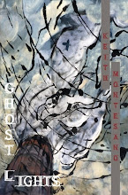
Just got my third set of Ghost Lights proof corrections sent off.
I'm starting to realize that I could see myself working, possibly somehow, in publishing in the future. Or I could see myself working for a press in some capacity at the very least. I'm really interested in everything that has to do with typesetting (as far as a computer program, not the old school way), font, look, size, etc.
Someone had a link on Facebook the other day to this interview with Jason Koo.
One of his poems is in the same issue of ACM I also have a poem in, and though I'd heard of him, I hadn't read any of his work until then. Now, after reading this interview, I'm even more interested in getting his book.
He also says one thing that I've never seen in an interview before, regarding the differences of labor and work, and it's something that I find extremely interesting, especially when it comes to the work he had to do on his book, the work that didn't involve taking seven years to get it accepted for publication:
Take my first book: it represents what I think of as my work, and each poem within it represents that work; but putting that book together was one mother of a labor-intensive process. The production of the book itself into a physical object was exasperating. C&R gave me total control over how the book turned out, which was great; but the downside was that I got almost no creative or editorial feedback. So I ended up having to make decisions about the width of the margins, the size and type of font for the poems, the poem titles, the page numbers, the first title page, the second title page, the epigraphs -- decisions I was not expecting to have to make. This might sound simple, but it’s not, especially if you’re not a professional designer; you don’t have a real idea of how things are going to look when they’re in book form. I had no idea that 12-pt Garamond -- which looks pretty small on an 8 ½ by 11-inch page -- looks huge on a 6 by 9-inch page. I wasn’t sure how to design my title pages, where to put the titles and name and how to big to make them. So there I was with a tape measure going through all my poetry books, comparing the designs and making these decisions on the fly. And when my manuscript went from Word to Adobe InDesign, all these little things got screwed up that normally get screwed up like the tabs for my indented lines that I’d spent hours setting when I prepared the manuscript for production (so they wouldn’t get screwed up). C&R’s designer was doing the best he could to make sure all the tabs were correct, but you can only stare at tabs for so long before you go crazy, and he only had weekends to work on the manuscript, so ultimately it was up to me to make sure everything came out right. Also, I didn’t have a proofreader; and honestly, could a proofreader even be expected to make sure all the tabs were correct for a poem like “2046 Love Songs of Wong Kar Wai”? That’s not in the proofreading manual. I went through so many rounds of corrections for the book before it was ready to be sent to the printer; and most of the time I wasn’t even looking at the words of the poems, I was checking tabs and margins with my tape measure. I think my girlfriend started to think she was dating a tailor. And my thought during all this time was: I’m not enjoying this. It wasn’t the work of poetry, even though I was preparing my first work of poetry. This was definitely labor, but clearly necessary labor if I wanted my book to look right.
It's pretty fascinating to me for a few reasons. Though Bear clearly knows what he's doing when it comes to making books (Dream Horse Press has not only been around for nearly ten years, but look at the future line-up, Ghost Lights excluded, and you'll see that it's a press that should be sticking around for a very long time to come...), I've gotten a lot of control with my choices thus far. I hope I haven't been too much of a pain in the ass also, with my questions and concerns and nitpicking, but I'm very particular when it comes to the look of a book, especially the font. Not only that, but a lot of my questions come from my lack of experience with this, in addition to my willingness to learn from someone who knows what they're doing.
Maybe one day I'll talk about some books that I don't think look overall too spectacular (though I probably won't, because it's not my place to go saying that about other presses, quite honestly), but I think it's important for people to realize that, if they can have a lot of control, they should spend time trying to make it a piece of art, in its entirety.
Sometimes, though, unfortunately, much of these wants are out of the poet's hands...
Granted, some folks get lucky and get with a press that not only lets them have a lot of control, but also has typesetters and copy editors and every other position you can think of, so they can concentrate on making sure their words are their words once they're officially on the page.
Even Jason's comment about Garamond in 12 point makes sense to me. My first proof was in a font that made me feel a little claustrophobic, so I wanted to see if Garamond was possible. Because some my lines are so long, we took the font down to 11, and right now it looks great. But in the back of my mind, I kept saying, "Is this too small?" I tried to imagine how it would look on the page, but it's tough when you only have a .pdf in front of you on the computer screen. From Jason's words, though, it looks like 11 should be just about right.
Jason also seems to do a lot of indenting with his poems, and many of the poems in Ghost Lights aren't left justified... I know this has been a pain to deal with also, because some of these programs don't seem to be as conducive to these types of corrections, but it's these things that you have to have, if the space on the page permits, exactly right.
I'm not really sure exactly what I'm trying to say here, but I think it comes down to being really interested in all the specific typesetting and book-making processes.
Now I'm noticing more things in books that I never noticed before.
Are the titles capitalized and not bold?
Are the titles italicized and not capitalized?
Are the titles bold and not capitalized?
How close together are the letters? Is the font boring?
Is the font claustrophobic?
And on and on and on...
Maybe some would call all of this labor, to a certain degree, but I really like this aspect of making sure everything is (at least closest to) exactly how I want it. And time is really not a factor when it comes to getting to these final stages, because though I ultimately want people to like the book for the poems inside it, it would also be great if they agreed with my choices that don't have to do with the words used.
*
I can't stop listening to the new Eluvium record, Similes. Talk Amongst the Trees is one of my favorite records of all time, and I was a bit disappointed, as much as it pains me to say it, with Copia.
But Similes is beautiful, sad, and pretty wonderful overall. There are vocals this time around, and some soft percussion in places. But many of the tracks also feel like "songs," which is new territory he's exploring.
Do yourself this small favor when time allows and pick it up.
*
Recently, we finally got a Blu-Ray player, one that plays multi-region and PAL discs, so we don't have to screw around with locked discs.
I keep saying to myself, "Where the hell have I been?" As far as technology goes, I don't understand how they do it, and I don't understand how we waited this long to witness it.
I'm a huge fan of Magnolia, for example, which is an amazing film too many people love to hate. I even skipped school in 10th or 11th grade to go see it. I've seen it at least twenty times by now, and in the first five minutes of the recently released Blu-Ray discs, I kept noticing things I had never seen (the sweep of the camera through Linda's closet, for example, showing the size of it, the detail of it, right before she exits to get in the car). So when you think about the entire three hours, it was really like seeing a different film.
When I got my IMac I was pretty impressed with all that it could do, and I still love it, but I feel like Blu-Ray is something pretty monumental in the grand scheme of technological advances of the last twenty years, at least.
Granted, I probably spend more time watching movies than I do writing poetry, so I can see how the average viewer with a 1080p TV says, "Yeah, it looks better," etc. But wow. I feel like a little kid again, and I haven't been this impressed with technology in a long time, if ever.
Take, for example, the long dolly shot in Children of Men, the one where blood gets spattered on the lens and the shot keeps going, when Theo has Kee and the baby and he's trying to get them to safety. Everything is literally heart-stopping, both visually and aurally.
The end of Full Metal Jacket: when Eightball's getting shot in slow-motion as the sniper draws the rest of the men in, and the backgrounds of smoke are curling, and fires flicker in crumbling windows and empty doorways. Then they wakj away in darkness as all the buildings are on fire around them.
And all the bright shots of Las Vegas in Casino? Completely insane.
Days of Heaven comes out in March. And tell me The Thin Red Line's not going to look immaculate, when it gets released of course.
And that's the other point: you can take a movie from the 60s or 70s and make it look and sound as amazing as it possibly can.
I'm sold. I'm beyond giddy and happy and excited. I'll be buying and renting many more Blu-Rays in the future, especially since they're, somehow, even cheaper now than regular DVDs.
skip to main |
skip to sidebar

Scoring the Silent Film
ORDER SCORING THE SILENT FILM
- Keith Montesano
- I'm the author of three books of poetry: Ghost Lights (Dream Horse Press, 2010), Scoring the Silent Film (Dream Horse Press, 2013), and Housefire Elegies (Gold Wake Press, 2017) Other poems have appeared or are forthcoming in Hayden’s Ferry Review, American Literary Review, Third Coast, Ninth Letter, Quarterly West, Blackbird, and elsewhere. I recently earned a PhD in English and creative writing from Binghamton University. Contact me @ kwmontesano [at] gmail [dot] com.
Ghost Lights Reviews
Interviews and Features
Published and Forthcoming Poems in Print
- American Literary Review
- American Poetry Journal
- American Poetry Journal (2)
- Another Chicago Magazine
- Barn Owl Review
- Barn Owl Review (2)
- Blue Mesa Review
- Cave Wall
- Center
- Cimarron Review
- Copper Nickel
- Crab Orchard Review
- Cream City Review
- Diner
- Eclipse
- Faultline
- Florida Review
- Flyway
- Fourteen Hills
- Fugue
- Gargoyle Magazine
- Grist
- Handsome
- Harpur Palate
- Hayden's Ferry Review
- Hollins Critic
- Hunger Mountain
- Lake Effect
- Madison Review
- Makeout Creek
- Mid-American Review
- Nimrod
- Ninth Letter
- Passages North
- Pebble Lake Review
- Pebble Lake Review (2)
- Phoebe
- Portland Review
- Redactions
- Redivider
- Redivider (2)
- RHINO
- River Styx
- Saint Ann's Review
- Sonora Review
- Sou'wester
- Spillway
- Sugar House Review
- The Pinch
- Third Coast
- Tusculum Review
- Tusculum Review (2)
- Weave Magazine
- Whiskey Island Magazine
Published and Forthcoming Poems Online
- 42opus
- Anti-
- Bellingham Review
- Blackbird
- Boxcar Poetry Review
- Collagist
- Connotation Press
- Conte: An Online Journal of Narrative Writing
- Devil's Lake
- DIAGRAM
- DIAGRAM (2)
- DIAGRAM (3)
- Diode
- Diode (2)
- Diode (3)
- Front Porch
- iO: A Journal of New American Poetry
- Lamination Colony
- Linebreak
- Linebreak (2)
- Pebble Lake Review (3)
- Quarterly West
- storySouth
- Superstition Review
- Verse Daily
- Verse Daily (2)
- Waccamaw
My First Book Interviews
- #1 - Matthew Guenette
- #2 - Paul Guest
- #3 - Christopher Bakken
- #4 - Brian Barker
- #5 - Jason Bredle
- #6 - Theodore Worozbyt
- #7 - Morgan Lucas Schuldt
- #8 - Jon Pineda
- #9 - Susan Settlemyre Williams
- #10 - Suzanne Frischkorn
- #11 - Brian Brodeur
- #12 - Mark Wunderlich
- #13 - Sarah Vap
- #14 - Alison Pelegrin
- #15 - James Allen Hall
- #16 - Alison Stone
- #17 - Randall Mann
- #18 - Cecily Parks
- #19 - Dan Albergotti
- #20 - Jennifer Chang
- #21 - Rauan Klassnik
- #22 - Andrew Kozma
- #23 - Anna Journey
- #24 - Clay Matthews
- #25 - Steven D. Schroeder
- #26 - Paul Hostovsky
- #27 - Allison Benis White
- #28 - Anna Leahy
- #29 - Jehanne Dubrow
- #30 - Alison Stine
- #31 - Rhett Iseman Trull
- #32 - Mari L'Esperance
- #33 - Gary L. McDowell
- #34 - Traci Brimhall
- #35 - Brent Goodman
- #36 - Leslie Harrison
- #37 - Sandy Longhorn
- #38 - Alexander Dickow
- #39 - Michelle Bitting
- #40 - Mike Dockins
- #41 - Elyse Fenton
- #42 - Bobby C. Rogers
- #43 - Laurie Clements Lambeth
- #44 - Nicholas Ripatrazone
- #45 - Luke Johnson
- #46 - Kyle McCord
- #47 - Justin Evans
- #48 - Jeremy Halinen
- #49 - Nicky Beer
- #50 - Shane McCrae
- #51 - Steve Kistulentz
- #52 - Anne Shaw
- #53 - Amanda Auchter
- #54 - Karen Rigby
- #55 - Jeff Alessandrelli
- #56 - Quinn Latimer
- #57 - Nick Courtright
- #58 - Christopher Hennessey
- #59 - Dean Rader
Other Writers and Bloggers
- Aaron Smith
- Adam Clay
- Aimee Nezhukumatathil
- Alberto Rios
- Alex Lemon
- Alfred Corn
- Alison Stine
- Amanda Auchter
- Andrew Shields
- Angela Vogel
- Anne Boyer
- Anne Haines
- Barbara Jane Reyes
- Bill Knott
- Blake Butler
- Bradley Sands
- Brandi Homan
- Brent Goodman
- Brian Barker
- Brian Brodeur
- Brian Foley
- Brian Leary
- Bryan Penberthy
- C. Dale Young
- Charles Jensen
- Christopher Bakken
- Claire Bateman
- Clay Matthews
- Collin Kelley
- Corey Spaley
- Cynthia Lotze
- Danielle Pafunda
- David Dodd Lee
- David Trinidad
- Deborah Ager
- Derek White
- Diane Kirsten Martin
- Douglas Kearney
- Eduardo C. Corral
- Edward Byrne
- Elisa Gabbert
- Emma Bolden
- Eric Smith
- Gary L. McDowell
- Greg Rappleye
- Hadara Bar-Nadav
- Ivy Alvarez
- J.P. Dancing Bear
- Jake Adam York
- James Hoch
- Jamie Iredell
- Janet Holmes
- Jeannine Hall Gailey
- Jee Leong Koh
- Jeff Newberry
- Jehanne Dubrow
- Jericho Brown
- Jesse Lee Kercheval
- John Estes
- John Gallaher
- Jon Pineda
- Jonathan Rice
- Jordan Davis
- Josh Maday
- Joshua Clover
- Joshua Marie Wilkinson
- Joshua Poteat
- Joshua Robbins
- Josiah Bancroft
- Julia Doxsee
- Justin Evans
- Justin Marks
- K. Silem Mohammad
- Kara Candito
- Karen J. Weyant
- Karyna McGlynn
- Kate Evans
- Kate Greenstreet
- Kathleen Rooney
- Kelli Russell Agodon
- Ken Baumann
- Kerry Neville Bakken
- Kim Chinquee
- Kristi Maxwell
- Kristy Bowen
- Kyle McCord
- Lee Herrick
- Leigh Stein
- Leslie Harrison
- Lisa Allender
- Lucia Perillo
- Luke Johnson
- Mark Doty
- Mark Yakich
- Mary Biddinger
- Mathias Svalina
- Matt Guenette
- Matt Hart
- Matt Henriksen
- Matthew Thorburn
- Michael Levan
- Michele Young-Stone
- Mira Bartok
- Montgomery Maxton
- Morgan Lucas Schuldt
- Nate Pritts
- Noah Eli Gordon
- Oliver de la Paz
- Paul Guest
- Peter Pereira
- Rachel Mallino
- Rauan Klassnik
- Reb Livingston
- Reginald Shepherd
- Rick Barot
- Rigoberto Gonzalez
- RJ Gibson
- Rob Schlegel
- Robert Peake
- Roger Mitchell
- Ron Mohring
- Ron Silliman
- Ryan Call
- Sam J. Miller
- Sam Pink
- Sam Rasnake
- Sandra Beasley
- Sara Tracey
- Sarah Klenakis
- Sarah Sloat
- Seth Abramson
- Shanna Compton
- Stacey Lynn Brown
- Steve Mueske
- Steven D. Schroeder
- Suzanne Frischkorn
- Tim Lockridge
- Tony Tost
- Zachary Barocas
- Zachary Schomburg
Literary Journal Blogs
Film and Cinema
- Anchor Bay
- AV Club
- Bow Tie Cinemas
- Bright Elephant
- Byrd Theater
- Criterion Collection
- Dario Argento
- David Gordon Green
- David Lynch
- David Wingo
- DVD Beaver
- Fantoma
- Harmony Korine
- Metacritic
- Plexifilm
- Sean Kirby DP
- Senses of Cinema
- Shout! Factory
- Simian Nation (The Works of Onur Tukel)
- Wanderlust Film
- Werner Herzog
- Wim Wenders